Afi Visual Identity: Redesigning a white-label wealth planner from the tokens up
Afi's Wealth Planner runs white-label for Spanish banks. Its 2026 redesign arrived as a one-line brief: make it look more modern. The product was built from static Figma screens, and developers worked screen by screen. I'm leading the work with Miguel, a freelance designer working with us part-time. We created the token system and component library in preparation for a design system migration.
Role: Design Lead
Contribution: UX/UI design, Design research, Design principles, Token system, Typography, Component library, Micro-interaction design
The brief was one line: make it look more modern. My boss had no complaint about what the product did, only about how dated it looked. Without a shared definition of modern, every review turns into taste arguing with taste. In a product designed screen by screen, each person's version of the word could land on a different screen.
Before opening Figma, I did the desk research and wrote it up as Modern UI in 2026. It ends on six checks the redesign gets reviewed against: a shared design language, screens built around user intent, motion that explains state, neutral surfaces with color kept for meaning, semantic tokens an AI can build on, and interactions that stay transparent, consistent and responsive.
Now a review tests a screen against the checklist instead of someone's taste. Color that decorates a card loses to color that marks a negative number, because the checklist keeps color for meaning.
A wide reference set gives you plenty to react to and no direction. And almost everything we liked was SaaS, built around a few common actions. Wealth Planner keeps adding options because it gets built to whatever a client needed that day, so no single product was going to fit it whole.
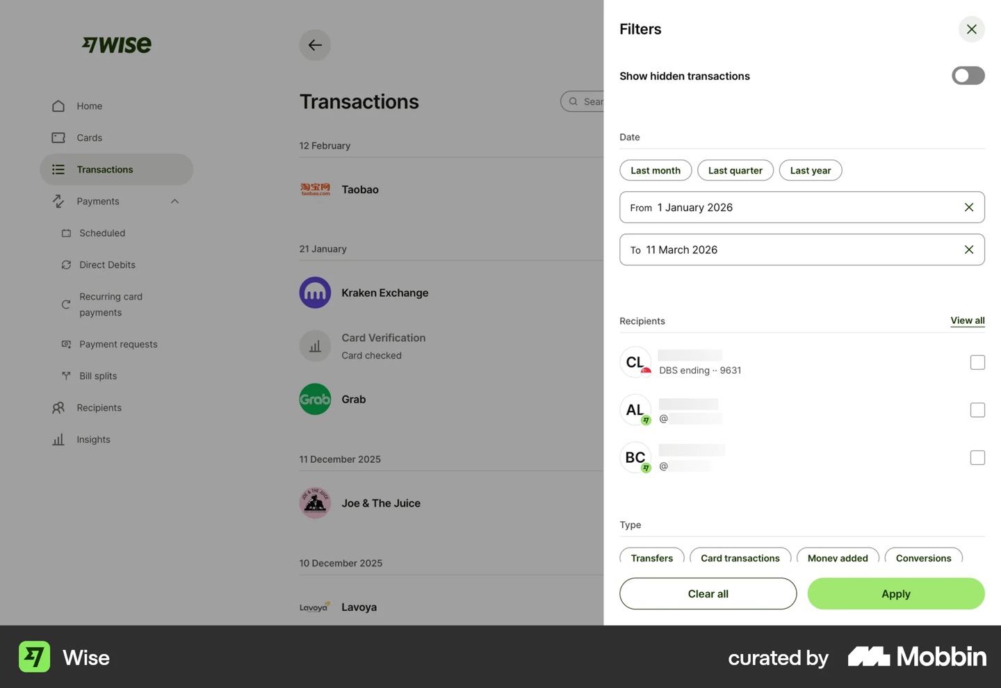
So we collected by component, not by product. Miguel and I each built a board in Mobbin, separately: buttons, inputs, menus, cards, dialogs, sidebar and filters, three or four screens each. Going through both boards one component at a time, Miguel noticed we kept picking the same six apps. We took the repetition as the signal.
The session gave us directions, not designs: buttons compact like Cursor's, menus like Clerk's with options only and no icons, Shopify for charts on cards. Wise, the only reference from our own domain, settled color: a financial interface can stay mostly black and white and spend color on the data.
A definition of modern tells you how the product should feel. It does not tell you whether editing opens a page or a drawer, or whether two controls that look alike can mean different things.
We tied the patterns we kept picking back to the research and wrote them down as nine principles. Among them: information density without visual density, progressive disclosure, consistency above novelty, and context over pages, so an edit happens in a drawer, inline or in an expandable card instead of on a new page. A second list names four things to avoid, starting with Material Design, whose opinions we had spent our time working around.
The rules that earn their place are about roles: one component, one meaning. Page navigation is tabs; mutually exclusive options are a segmented control. An add-on tag and a beta tag describe what you're looking at, but a pro tag is selling you something, so it can't look like them. That fixed the problem we kept hitting: one component appearing twice on a page, meaning two things.
Screen-by-screen design leaves the foundations open. A color gets picked for one screen with nobody naming the job it does elsewhere. Typography is worse in a financial product: when 0000 and 4444 take up different widths, columns stop lining up.
We set up the primitive and semantic tokens in black and white and named each by its role, background canvas or background elevated, before picking a single color. Spacing got the same treatment, like nav-to-content and canvas padding, and no corner is rounder than 6px. For type, we ran Space Grotesk, Fira Sans, Geist and IBM Plex Sans through the same number patterns.
A screen asks for a canvas, not a hex value, so the palette can change later without renaming anything. Space Grotesk, Fira Sans and Geist drifted; IBM Plex Sans held, so it became the type family. The test used each font's default figures, which is what a screen gets unless someone turns on tabular numerals. Shadows and dimensions are the next two passes.
Hover them: these run on this site's own tokens. The Afi components themselves are in the workbench at the top of the page.
Foundations do not give you an interface. Wealth Planner still needed buttons, inputs, tables and dialogs whose states behave the same everywhere, and building those inside each screen reopens every decision that just closed.
We split the primitives: chip, badge, card and table for me; tag, dialog, navbar and tabs for Miguel. Buttons, inputs, checkboxes and toggles we built together first, to agree on one workflow. Each component starts in code, from the moodboard. An AI agent then builds it in Figma with the correct variables, adds any that are missing and drafts the documentation. We adjust it, then build it into the Afi library through the Figma MCP.
Two skills keep the library consistent. /ds-cleanup audits a component or page, flags where it drifts from the system and fixes it on a second prompt. /ship commits and pushes, then hands back a Figma prompt for any variable that changed, so Figma and code don't drift apart. The workbench at the top of this page is where the team reviews each component on its own.
Every state change explained by motion: the checkbox draw, the radio fill, the toggle flip, and a send flow that walks through send, sending, sent.
A component at rest does not tell you what happens when someone acts on it. Decide that inside each feature and the timing drifts even when the colors match. It matters more now: a generated interface arrives correct and generic, and small physical responses are one of the few things it does not hand you.
We didn't invent most of the animations. We reverse-engineered the ones that inspired us, or took a React library like Magic UI or Animate UI, ported it to Angular and iterated. The press state came out of the moodboard session: the button sinks in, the way a physical one does.
A checkbox draws its check, a radio fills, a toggle flips, and a send button runs from send to sending to sent. They're rules, not decoration, so a larger pattern reuses the response instead of inventing its own.